Work One token source for a TV and two tablet orientations.
Real estateSales appJul – Aug 2026

One token source for a TV and two tablet orientations.

A real-estate sales app on a showroom TV and on tablets held either way. Text that reads at arm's length is too small across a room, and I didn't want three designs.

My role
UX and UI for the TV and tablet screens, token architecture
When
Jul – Aug 2026
Platform
React Native: TV, tablet landscape, tablet portrait
Client
A real-estate developer. The project is on hold.

Impact

4token layers, from raw value to semantic
3viewing distances from one source
5TV layouts tried on the same tokens

The problem

The same screens had to work beside a customer and across a showroom, in landscape and portrait.

At sales events, staff had no good way to present a project at a booth or sales gallery. The answer was a presentation mode: one project at a time, with site plan, floor plans, unit types and facilities.

Four layers

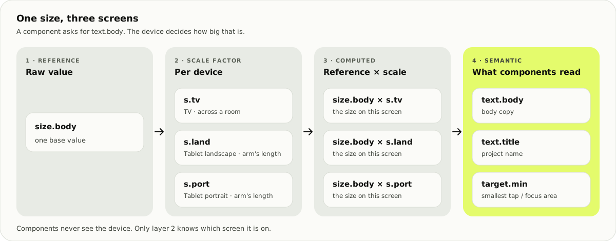
Components only read the last layer. Everything device-specific sits in the scale factor.

1 · ReferenceRaw values

The palette and base sizes.

2 · Scale factorPer device

TV, landscape, portrait.

3 · ComputedReference × scale

Sizes for this screen.

4 · SemanticWhat components use

Text, surfaces, actions.

Four columns: a reference size, a scale factor for TV, tablet landscape and tablet portrait, the computed size for each, and semantic tokens text.body, text.title and target.min that components read.
A component asks for text.body. Only the scale factor knows which screen it is on.

Five TV layouts from one tablet screen

I started from my landscape tablet screen, 1194 × 834. For the TV, I made a moodboard of streaming apps. Three patterns kept coming up: no fixed nav bar, full-bleed images with a dark scrim, and rows of thumbnails.
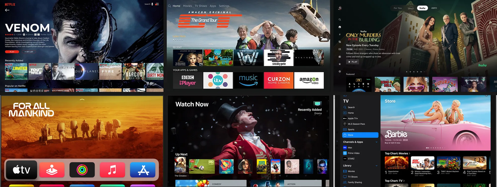
Six streaming-app screens from the moodboard: Netflix, Prime Video and Hulu on a TV, the Apple TV home screen, Apple TV Watch Now, and the Apple TV app on iPad. Each has a large image at the top and rows of thumbnails underneath.

Netflix, Prime Video, Hulu, Apple TV on TV and on iPad

Part of the moodboard: streaming apps on a TV and on iPad.

What I took from the references

Full-bleed imageThe photo is the screen

The project photo fills the TV. Price and details sit on a dark glass card over it.

Rows of thumbnailsPlans in one row

Floor plans line up in a row. The selected plan is larger and has an orange outline.

No fixed nav barA slim top bar

Only three sections, playback and close stay on screen. The floor-plan screen drops the bar for chips.

Then I had AI generate five layouts of that screen, using every element (even four hidden Figma layers) and the file's own colour and type variables. Only the layout changed, so I could compare directions on the same tokens.
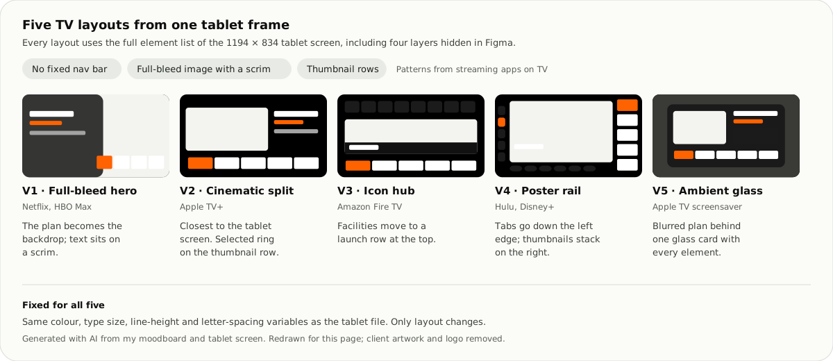
Five wireframes: V1 full-bleed hero, V2 cinematic split, V3 icon hub with facilities at the top, V4 poster rail with tabs down the left, V5 ambient glass with a blurred plan behind one card.
Five TV directions. V2 stays closest to the tablet screen.

On the TV, a project plays in three parts

Then I designed the TV screens. Each project runs as three sections in a slim top bar: project details (รายละเอียดโครงการ), the look and feel of the project (บรรยากาศโครงการ) and register (ลงทะเบียน). An orange line under the sections fills as the project moves from one part to the next.

Staff stay in control from the same bar: pause (หยุด) or play (เล่น), the previous project (ดูโครงการก่อนหน้า), the next project (ดูโครงการถัดไป) and close.
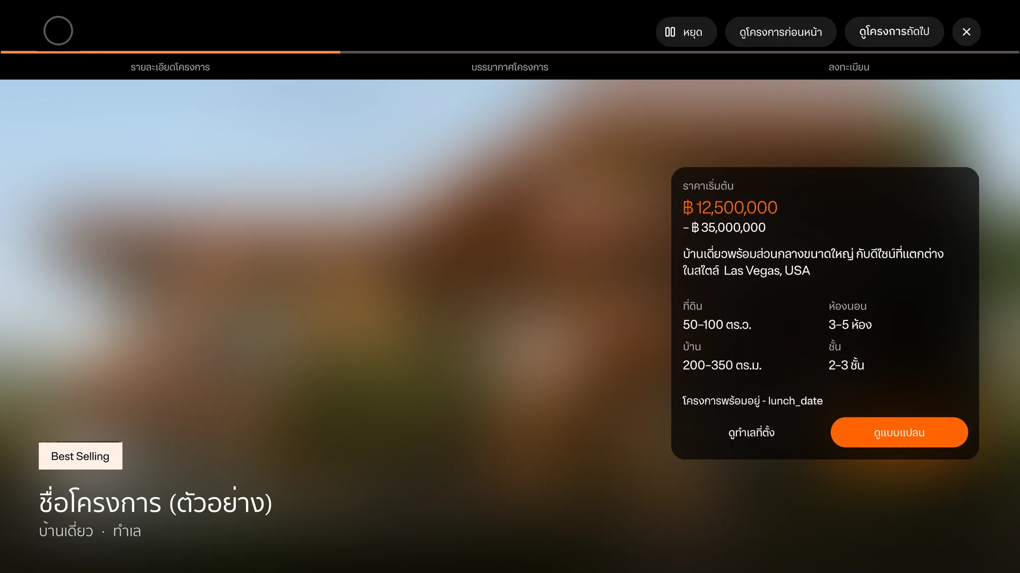
TV project details screen. A full-screen project photo with a dark card on the right: starting price 12,500,000 to 35,000,000 baht, a one-line description, land 50 to 100 square wah, house 200 to 350 square metres, 3 to 5 bedrooms, 2 to 3 floors, and two buttons, see location and see floor plans in orange. The project name sits bottom left under a Best Selling tag. The top bar shows the three sections with the first one active, and pause, previous project, next project and close.

Project details: the first of three parts

  • Details on one card. Starting price, land and house size, bedrooms and floors sit on a dark card over the photo, with two actions: see the location (ดูทำเลที่ตั้ง) and see floor plans (ดูแบบแปลน).
  • Look and feel. Eight photos a page in a four-by-two grid, with arrows and page dots.
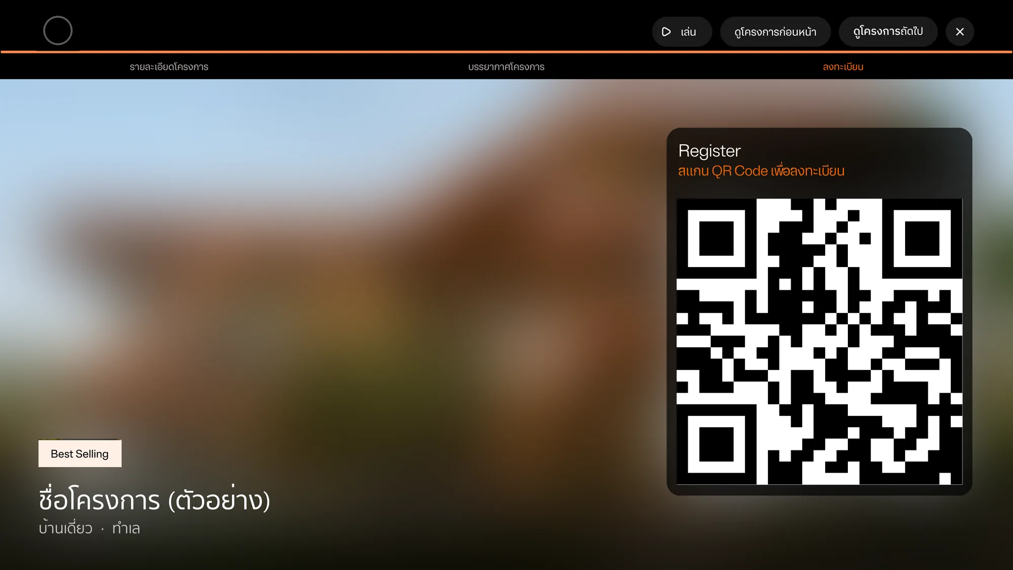
  • Register by QR. A large QR code over the project photo. Customers scan it with their own phone, so nobody types on the TV.
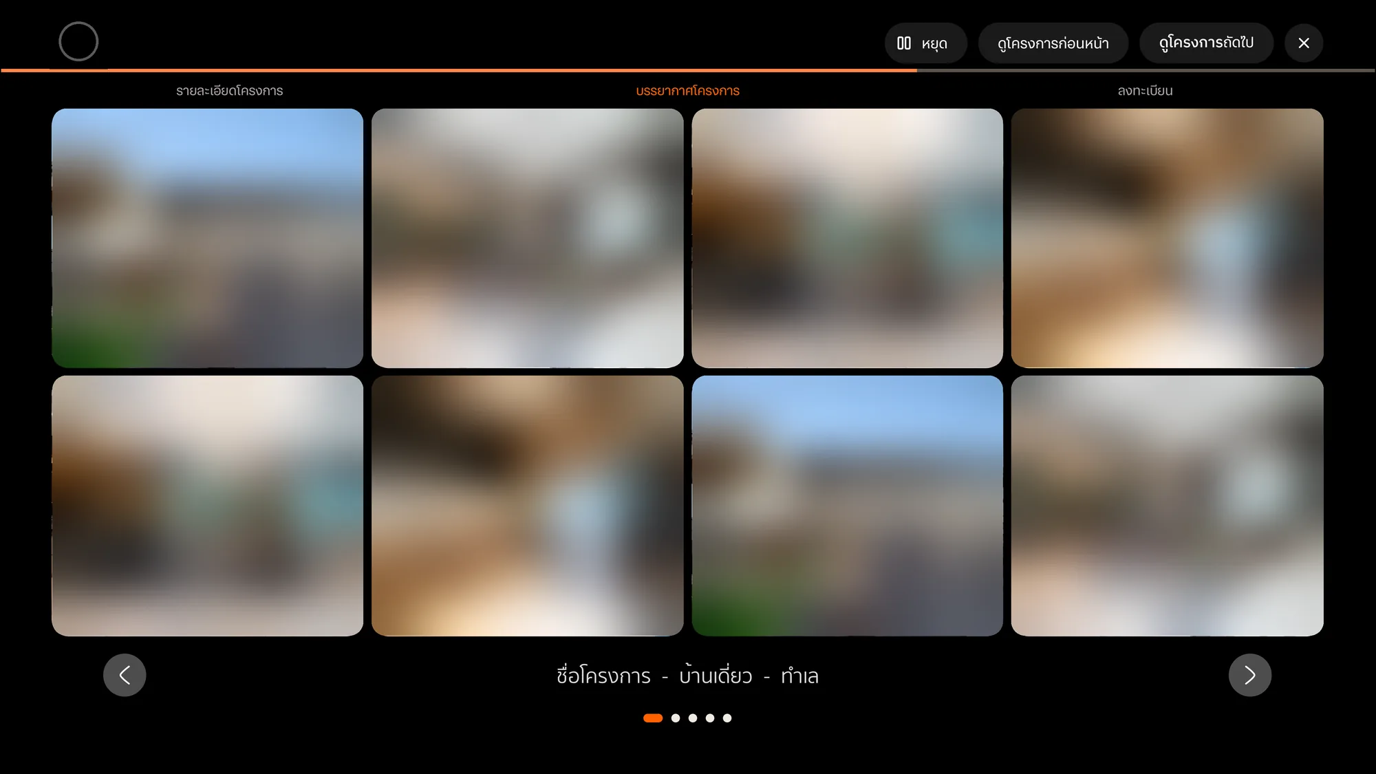
TV look-and-feel screen: eight project photos in a four-by-two grid with rounded corners. Round arrow buttons sit left and right, the project name is centred below, and five page dots show the first page. The second section in the top bar is active.

Look and feel: eight photos a page

TV register screen: the project photo with a dark card on the right titled Register, an orange line that says scan the QR code to register, and a large QR code. The third section in the top bar is active and the playback button shows play.

Register: scan, no typing on the TV

The other two parts.

I tried the floor-plan screen several ways

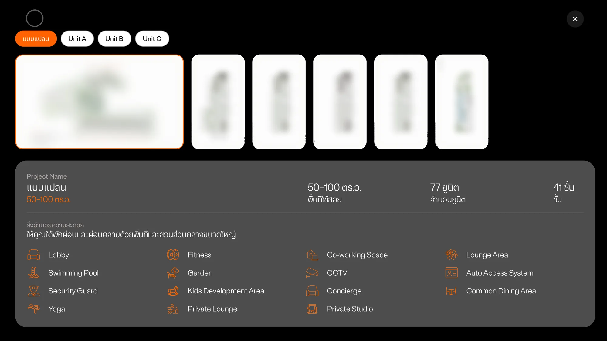
Every arrangement has the same parts: chips for the master plan and each unit type (แบบแปลน, Unit A, Unit B, Unit C), the plans themselves, and a panel with the usable area, number of units, floors and facilities. Each facility is an orange icon with a label.

They differ in two things: how much room the selected plan gets, and whether the panel sits beside the plans or under them.
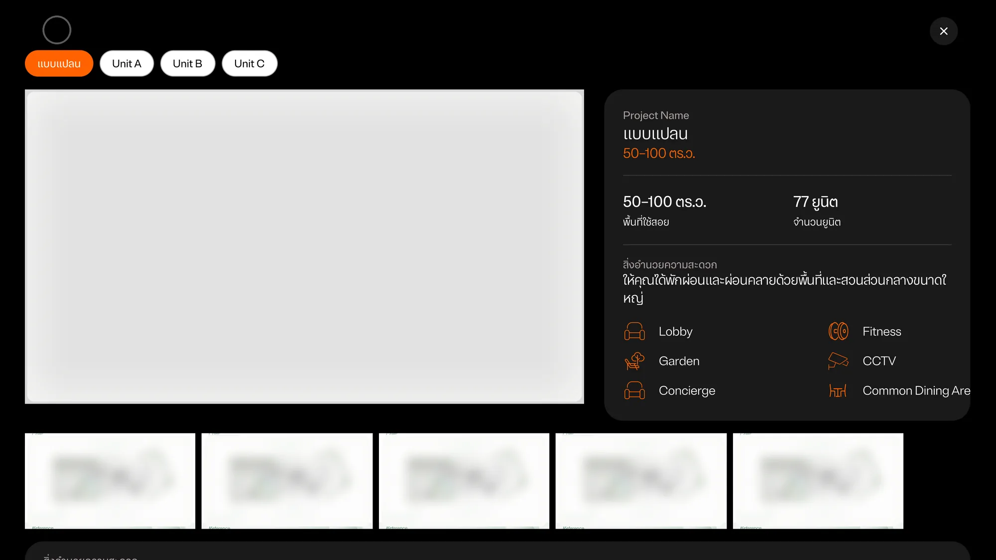
Floor-plan screen, version A: a large grey plan area on the left, the info panel on the right with area, units and six facilities, and a row of five plan thumbnails along the bottom.

A · Panel beside the plan, thumbnails below
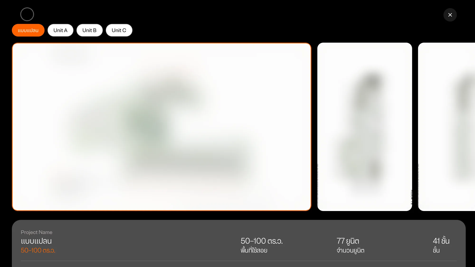
Floor-plan screen, version B: the selected master plan takes most of the width with an orange outline, the next plans peek in from the right, and the info panel starts below.

B · Selected plan large, panel below

Floor-plan screen, version C: a short row of six plans with the first one outlined in orange, and a large panel below showing area, units, floors and all fifteen facilities in four columns.

C · Compact row, every facility in view
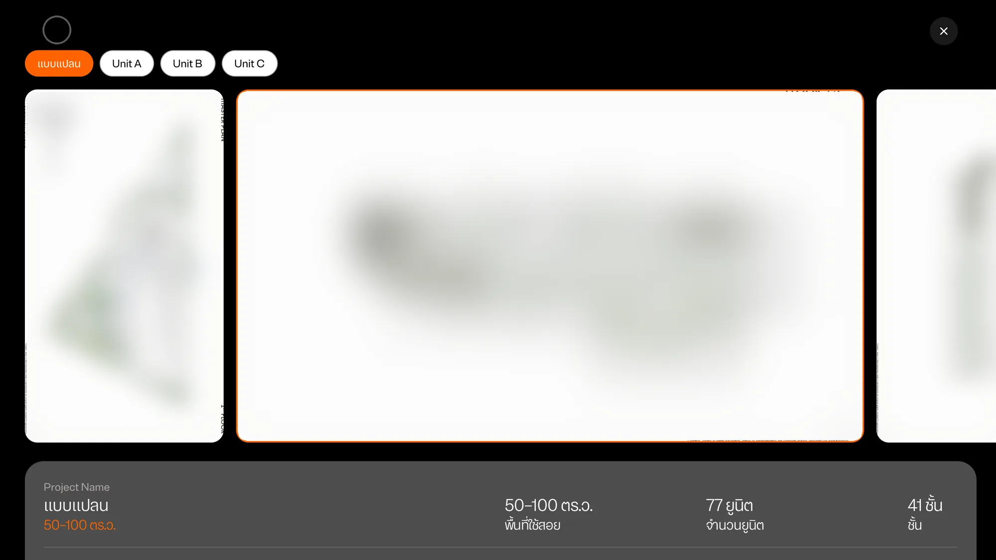
Floor-plan screen, version D: the second plan in the row has grown to most of the width with an orange outline, with the plan before it and the plan after it on either side.

D · Selected plan grows inside the row

Four of the arrangements, on the same tokens.
InteractiveArrow keys and Enter work like a TV remote. Pick a unit type, then a plan.

On a tablet, the details card moves when you turn it

The tablet keeps the TV's top bar, sections and playback controls. In landscape (1194 × 834) the details card stays on the photo, as on the TV. In portrait (834 × 1194) the details move under the photo, and the two buttons share the full width at the bottom.
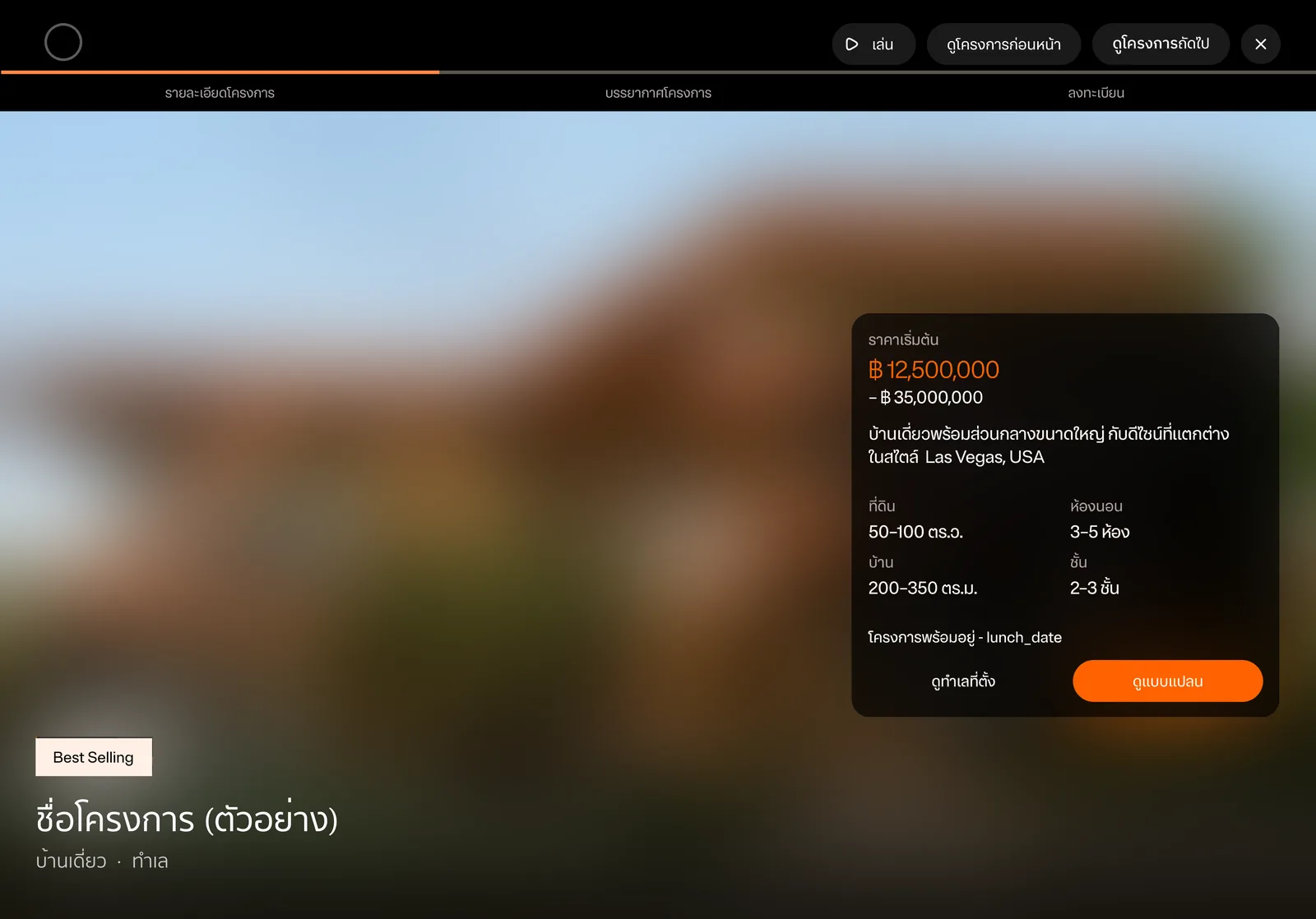
Tablet landscape project details screen: the same layout as the TV, with the details card on the right and the project name bottom left.

Tablet, landscape: card on the photo
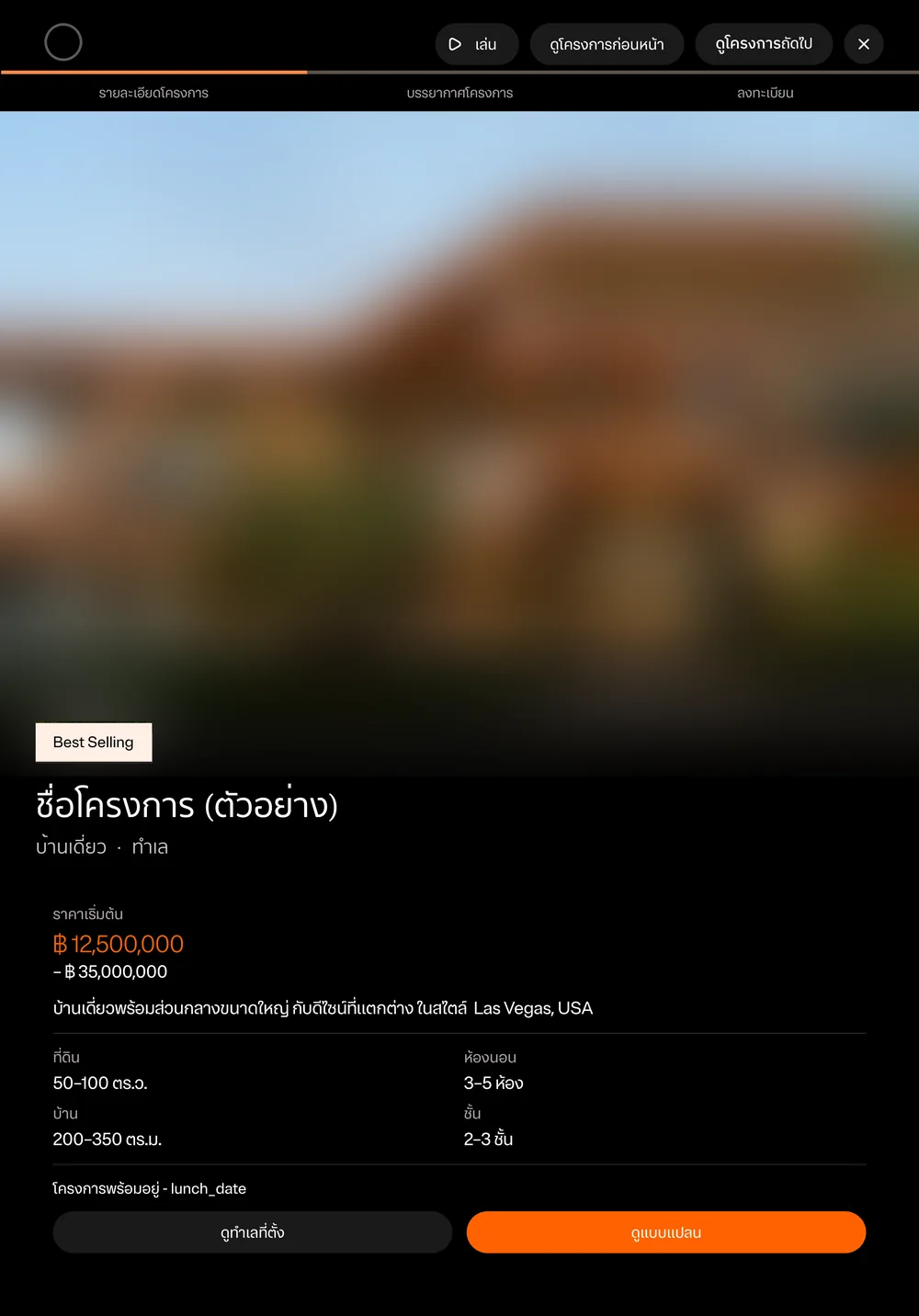
Tablet portrait project details screen: the photo fills the top half with the project name at its bottom edge, and the price, details and two full-width buttons are stacked below on black.

Portrait: details below

One screen, two orientations.

Designing for a 10-foot screen

  • Focus, not hover. On a TV there is no cursor, so every interactive element needs a clear focus state and a predictable order.
  • Bigger targets and type, from the scale factor. No separate TV components.
  • Presentation first. The TV is for showing a customer. No data entry.

Checking the code first

The code used the framework's default type scale about 50 times, and 5 of the 13 project tokens were never used. Nobody had chosen that default scale, so tokens should replace it.

No font family was set on iPad, tvOS or Android, so everything used the system font. Line-height and letter-spacing were rarely set. With no shared text component, each screen set its own size and weight, and one style appeared three ways.
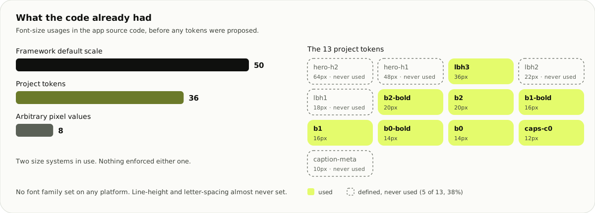
Bar chart: 50 font-size usages of the framework default scale, 36 of the project tokens, 8 arbitrary pixel values. Of the 13 project tokens, 5 are never used.
The audit, before any tokens were proposed.

Also in these two months

I also worked on a pre-sales bid for a LINE Official Account service platform. That work is in the pre-sales case.

Next caseI connected a bank's lead pipeline, from campaign to who can see the lead.