The problem
Every squad built its own screens from its own specs, so the same choice looked different from flow to flow. Three groups paid for it:
- Customers saw an app that felt like several apps.
- Developers rebuilt components another squad already had.
- QA had no reference, so a UI bug in one squad was "fine" in another. UI bugs crowded out feature bugs.
The inconsistency ran at two levels:
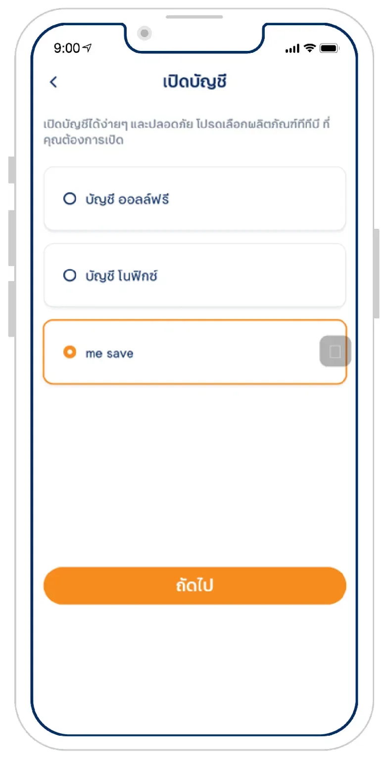
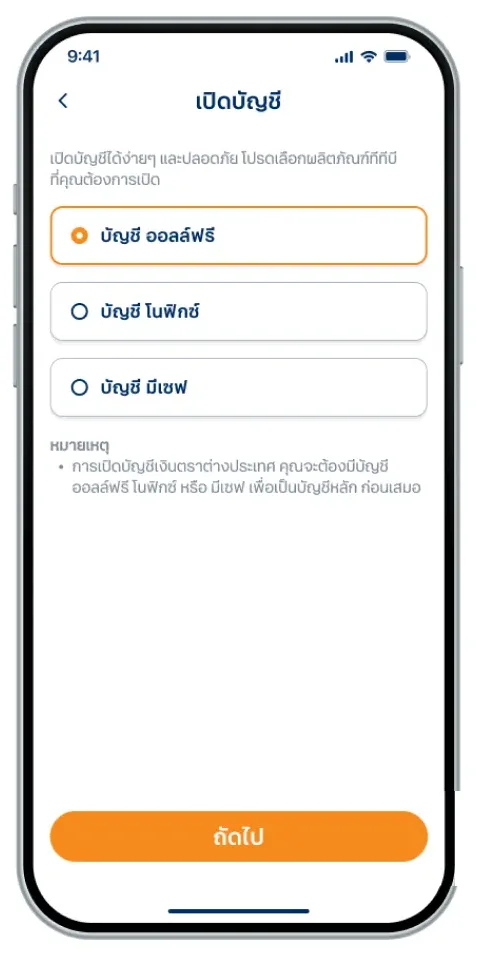
- Style: the same radio card in different heights and spacing, and the same product named "me save" on one screen and บัญชี มีเซฟ (me save account) on another.
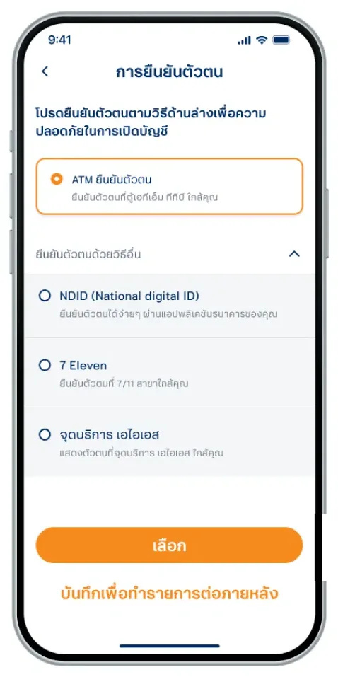
- Pattern: no rule for when to use a radio card or a plain radio row, or when a bottom button should stay pinned or scroll with the form.
A component library fixes the first level. Only a written guideline fixes the second.
What I did
- Audited real use cases across products, starting with the selection controls.
- Designed component structures that covered every case I found.
- Agreed design guidelines with the team, including usage rules for patterns.
- Wrote the handover so the design system developers could build each component.
- Joined the squads: their events, their UX/UI design phase, and BA flow reviews. I covered everything design-system related: tokens, components, patterns and error states.
- Bridged two dev teams: the design system developers and each squad's developers.
- Helped QA verify UI against the guidelines and Storybook.
In 2022 design systems were still new in Thailand. We started with designers only and grew into a full team with iOS, Android and web developers, and specs moved from Zeplin to Figma. I also designed UI flows for the CS and COB teams.
Example: the radio card
I designed the radio card as a base structure with fixed slots: the selection control, a title and value row, a content area, and an action row. In the car-loan flow, the lending squad filled the slots with its rates and coverage package. It didn't touch styling or radio behaviour. Its estimate dropped from building a new component to using an existing one.
When a squad needed something the library didn't have, I routed it to the design system team as a new base component. Squads stayed on product features.

What changed
- QA had evidence to test against: the library and Storybook.
- Developers could rely on design system components instead of building their own.
- UI bugs went down, so squads spent their time on feature bugs.
- Squad estimates went down, because base components came from the design system team.
Legacy products move over slowly; there's no business case yet for a full migration.
What v2 taught us
v2's tokens and components were too specific, so every new need became a new variant. That's why we started v3 in late 2023, which I led. Read the v3 story.
What I learned
A design system is a product. It needs to be adopted, not just built.From my notes on the project
And a library is only half of it. It fixes the spacing; only a guideline answers "card or row?"