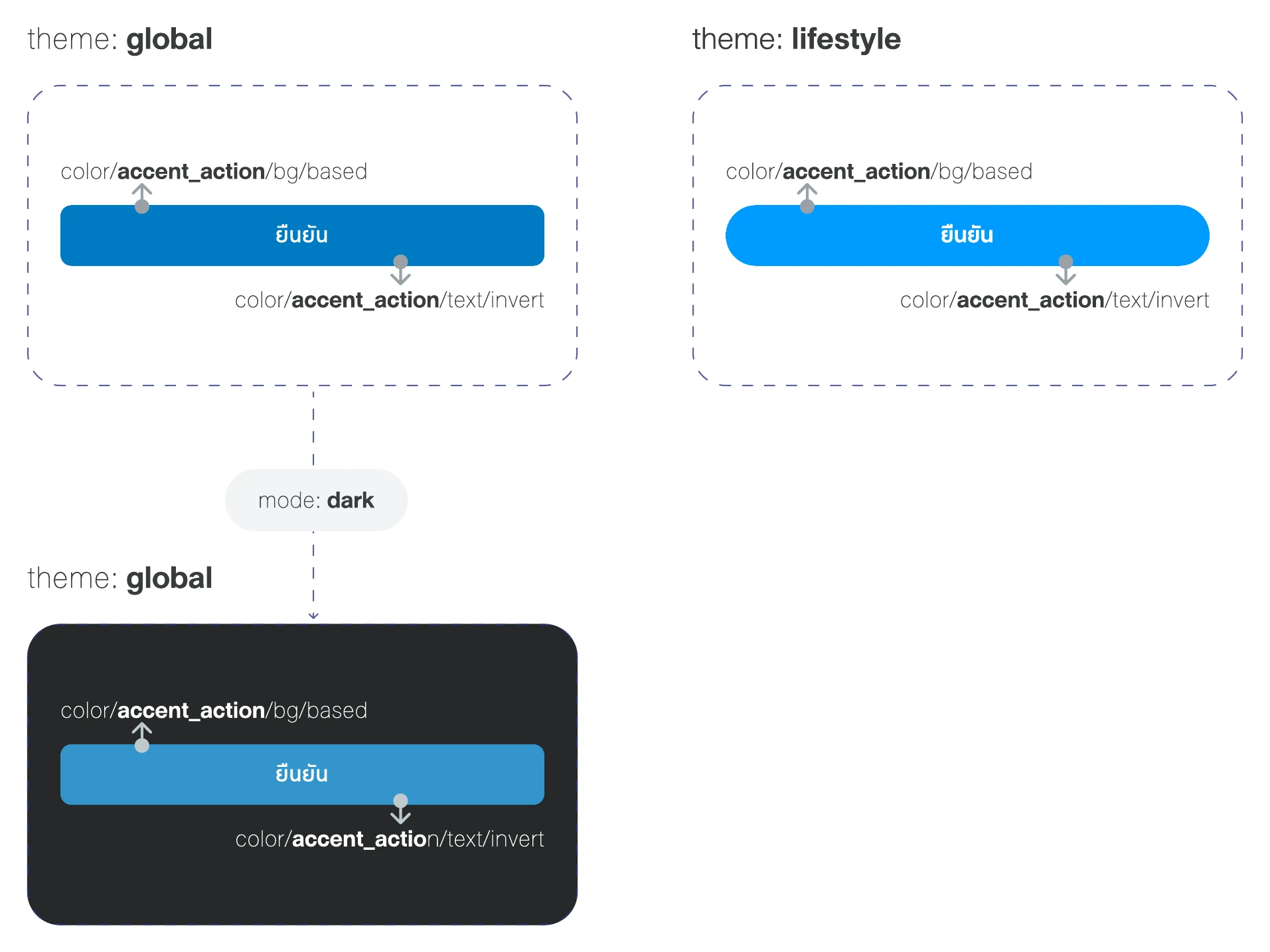
Try the switches above. The ยืนยัน (Confirm) button is one component: the theme changes its color, font and radius together, and every example below follows. Colors are close to production, adjusted for contrast; exact values stay confidential. Fonts are open stand-ins.
Three months was enough because I had done this before
- On ttb's v2 I watched tokens that were too specific turn every new need into a new variant. At Thai Life, every token was named by intent from day one.
- On v3 I had already made each brand a Figma variable mode. Thai Life pushed the idea to theme, light and dark, type and radius.
- Working beside iOS, Android and web developers at ttb shaped how I set up names, specs and handover here.
The ttb story is in two parts: v2, nine squads and one way to build a screen, and v3, two brands with one component library.
The question that made it hard
Can one token system cover two themes, light and dark, several products, three font families and variable shape, without duplicating a single component?The brief I set myself
My answer: every visual dimension is a variable mode. Components stay identical and resolve per context.
What's inside
- 01Mode hierarchy
- 02Token collections
- 03Token naming
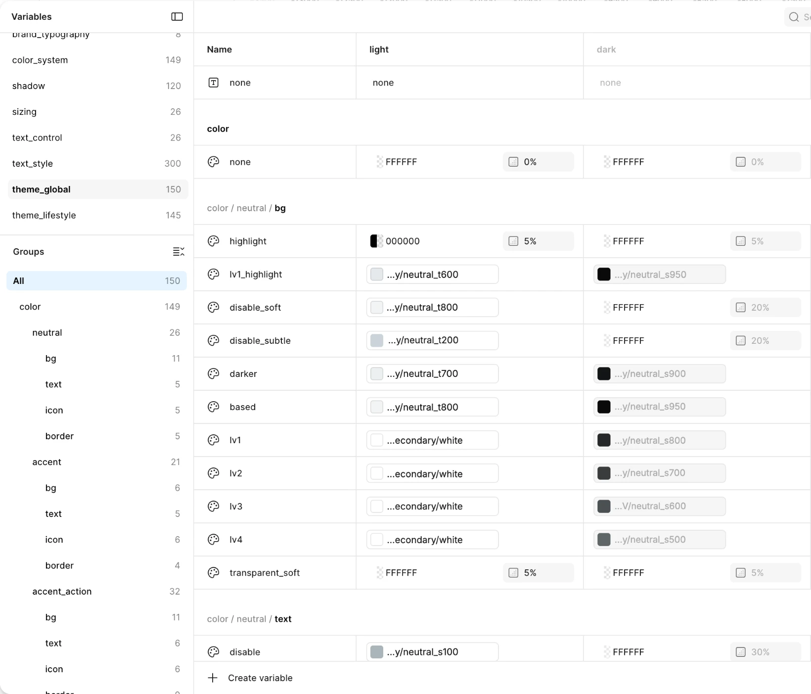
- 04Color groups
- 05Background and shadow
- 06Typography
- 07Sizing and radius
- 08Components and handover
Mode hierarchy
Each brand color is generated into shades and tints in 10% steps, named like brand/primary/brand_red_s100 for a 10% shade.
Tokens grouped by what they control
The tokens are split by what they control, so each collection only changes what it owns.
brand → colorThe brand palette in shade and tint steps, then the semantic tokens named by intent. color switches by theme (Global, Lifestyle) and by light or dark.
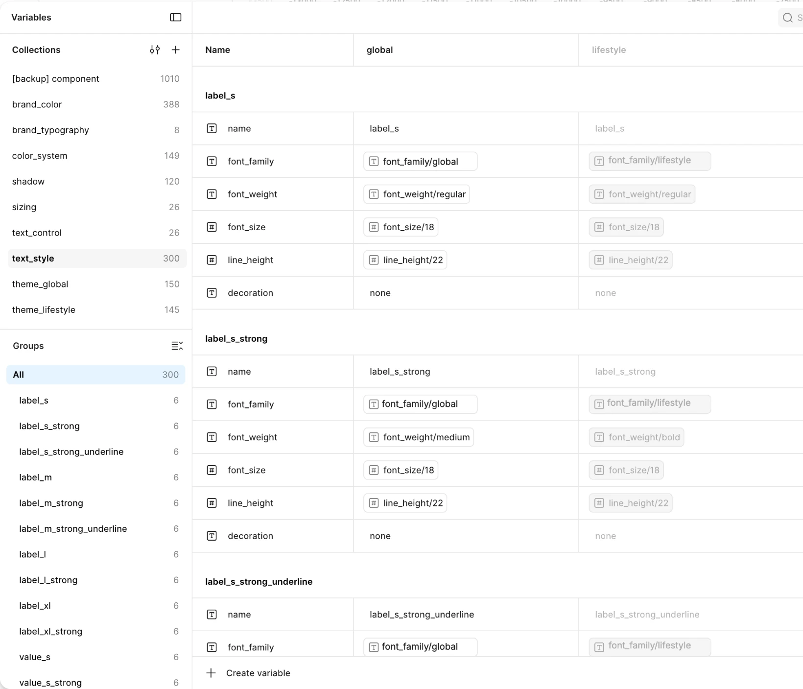
text_control → brand_typography → text_styleSize and line height per scale, then families and weights, then the published styles.
sizingOne scale for padding, gap and radius.
shadowElevation from shadow_base to shadow_lv4, and shadow_up for elements at the bottom of the screen.
Token naming
colorPrefix/accent_actionGroup/bgElement/invertVariant_on_hoverState
| Part | Required | Values |
|---|---|---|
| Prefix | Yes | color/ |
| Group | Yes | neutral, accent, accent_action, success, error, warning, information, infographic |
| Element | Yes | bg, text, icon, border |
| Level / priority | Varies | based, lv1–lv4, primary, secondary, tertiary |
| Variant | Optional | subtle, soft, invert, highlight |
| State | Optional | disable, on_press, on_hover |
color/accent_action/bg/based (CTA background) · color/error/border/primary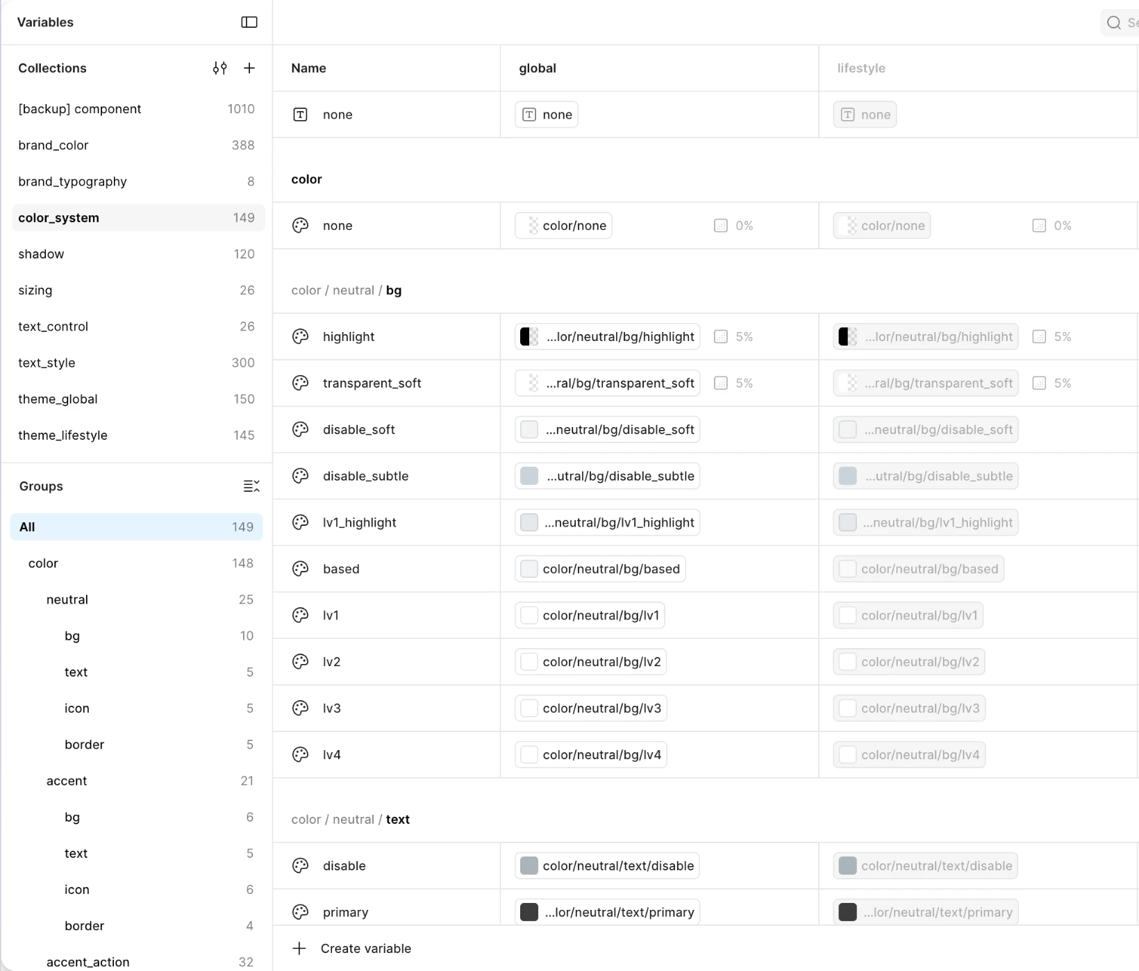
Eight color groups, one switch
Every group has the same parts, so one mode change restyles them all. Try it on the tiles below.
neutralaccentaccent_actionsuccesserrorwarninginformationinfographic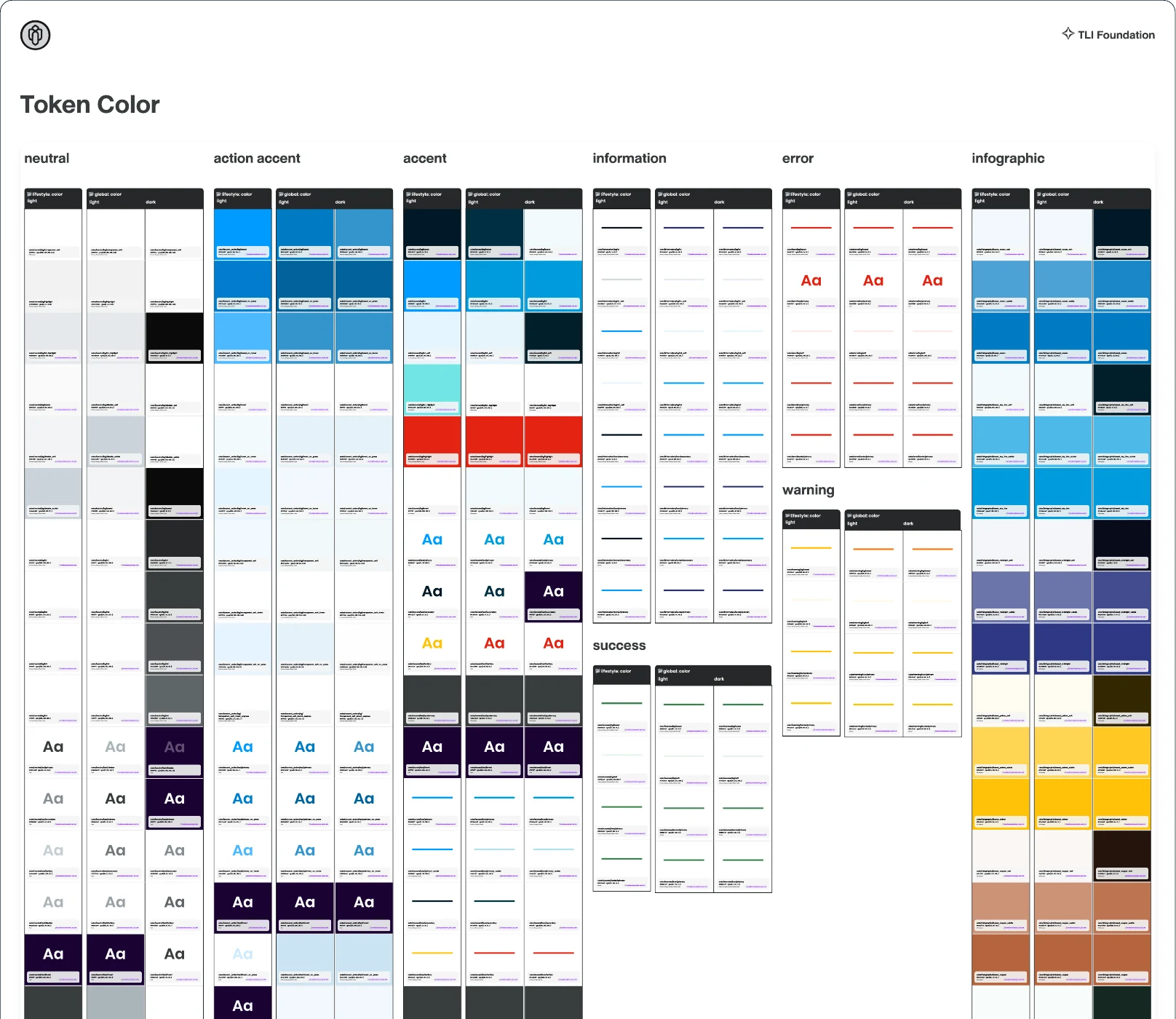
Tokens on a real screen
The docs show the tokens on a sign-in screen, rebuilt here with representative colors. Each part reads one token.
color/neutral/bg/based color/neutral/bg/lv1 color/neutral/text/primary Sign in or register 3
Register before you sign in to get member services. 4
Enter a 10-digit number 5 Sign in 6color/neutral/text/secondary color/error/border/primary color/accent_action/bg/based …/text/invert Background elevation
Backgrounds layer from based through lv1–lv4 to hl. The rule: lv2 can only sit above lv1. Shadows climb the same way, from shadow_base to shadow_lv4, with a shadow_up set for sticky footers and bottom sheets.
shadow_baseBackground elementsshadow_lv1Buttons, floating elementsshadow_lv2Modalsshadow_lv3Dropdowns, tooltips, context menusshadow_lv4Overlays, floating panels, popupsshadow_up_*Sticky footers, bottom sheets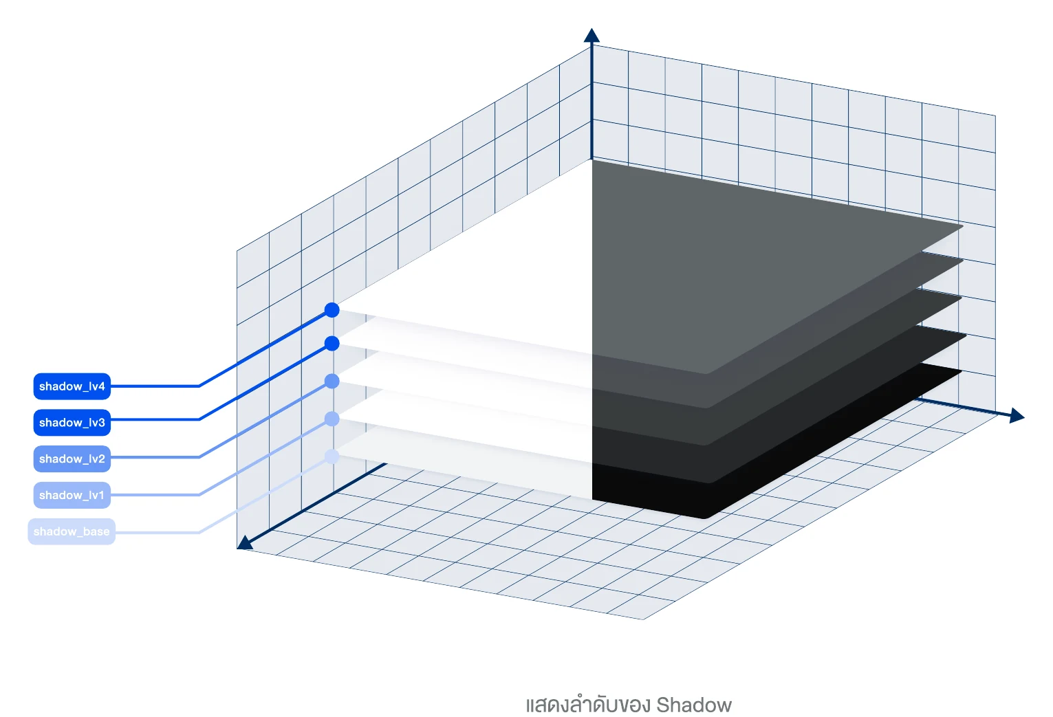
Typography in three layers
Font size and line height per scale (S, M, L).
Three families (display, heading, body), four weights.
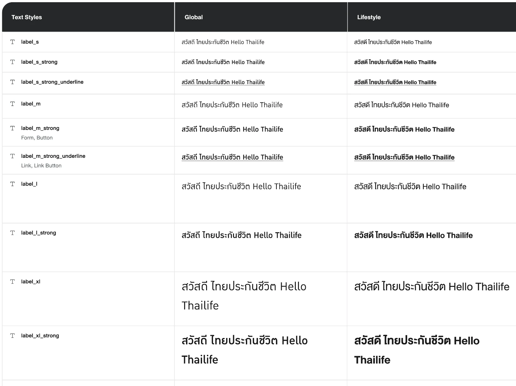
Published styles built from layers 1 and 2, switchable by theme.
Text size follows the phone's setting: S, M and L match iOS Text Size and Android Font Size. Line height is 120% for two families and 180% for the third, which Global uses for all text under 18px.
Use the Text size switch (S, M, L) to scale every style at once.
heading_2xlสวัสดี Hello Thailife
heading_xlสวัสดี Hello Thailife
heading_lสวัสดี Hello Thailife
heading_mสวัสดี Hello Thailife
body_lสวัสดี Hello Thailife
body_mสวัสดี Hello Thailife
label_l_strongสวัสดี Hello Thailife
metadataสวัสดี Hello Thailife
One scale for padding, gap and radius
Padding, gap and radius all read from one sizing scale, mostly in 4px steps, plus 1, 2 and 6.
Radius: none, small buttons, cards and inputs, main containers, avatars.
Radius stops at sizing.24, padding and gap at sizing.40 (a hero can go further). Inside a component, the gap sits two steps below the padding: 16px padding, 8px gap.
Radius belongs to the theme too: small rounded corners in Global, fully round in Lifestyle.
Components in three groups
Button, Input, Checkbox, Radio, Toggle, Select, Badge, Avatar
Card, Container, Divider, Grid, Stack, Drawer, Modal
Alert, Toast, Tooltip, Progress, Skeleton, Loading
Each component is built once and reads its values from the collections, so switching a mode restyles all of them.
Handing over to 6–7 developers
With 6–7 frontend developers, the handover had to leave nothing to interpret.
- Token names agreed with the developers, so a name in Figma is the same name in code.
- A spec for each component that lists every state: default, hover, focus, disabled and error.
- Walkthroughs of the Figma file and its variables, with questions.
- Governance docs: how to contribute, the naming guide, how to deprecate a component, and the version policy.
What I learned
The goal isn't reusable components. It's a configurable design foundation.From my notes on the project
Get the token architecture right and a new brand is configuration, with no rebuild. If a component exists twice, the token model is wrong.