Part 1 · Lab results in the patient app
New result types were coming: microbiology PDFs, pathology, genomics. The brief was to fit them in without redesigning the screen patients knew.
How I read the backend
How the hospital system stores a result
- Visit
- Orderhas an Order No.
- Lab reportone per lab section and release · files show here
- Specimenone tube, so one blood draw can be three
- Testvalue, flag, range · the app shows one card per test
What I designed around it
- The feed can't name the tube
- Grouping by specimen was dropped
- Every test has a category
- Group by category, cut to 4
- Files sit above the test
- Rules decide which card shows a file
- We don't own the hospital system
- Every fix lives in the app
From my first idea to what the data allows
Scroll. Each step names a problem, then shows the change in place.
- 9:41Lab ResultsAmphetamine/Methamphetamine (Urine) screening testNegativeHepatitis B surface Antibody (HBsAb)19results›CKD-EPI: eGFR if Chinese›90.82 mL/min/1.73m^2Fasting Blood Sugar (FBS)›102 mg/dLReference Range7099Complete Blood Count (CBC)19results›RBC3-5 Cell/HPF9:41Lab Results18 FEB 2026Blood test3 collections · latest 14:50All results ›14:50LatestNew· Dr Jane Doe 1Toxoplasma gondii Ab, IgG (Blood)See result in attached document›11:45· Dr John Doe 2Complete Blood Count (CBC)19 results›HbA1c6.6 %High›Anti-dsDNA (IFA)See result in attached document›08:30· 2 doctors 1Fasting Blood Sugar (FBS)102 mg/dLHigh›Problem 1
One long list
Blood, urine and immunology already shared one list. File-based results were about to join it.
Before · Everything mixed After - First idea
Group by what was taken from you
Patients remember a morning blood draw, not a lab category. One card per specimen and day, collection times inside.
- 9:41Lab Results18 FEB 2026Blood test3 collections · latest 14:50All results ›14:50LatestNew· Dr Jane Doe 1Toxoplasma gondii Ab, IgG (Blood)See result in attached document›11:45· Dr John Doe 2Complete Blood Count (CBC)19 results›HbA1c6.6 %High›Anti-dsDNA (IFA)See result in attached document›08:30· 2 doctors 1Fasting Blood Sugar (FBS)102 mg/dLHigh›9:41Lab ResultsAll 13General tests 9Infection tests 2Biopsy & cell tests 1Genetic tests 1Amphetamine/Methamphetamine (Urine) screening testNegativeHepatitis B surface Antibody (HBsAb)19results›CKD-EPI: eGFR if Chinese›90.82 mL/min/1.73m^2Fasting Blood Sugar (FBS)›102 mg/dLReference Range7099Complete Blood Count (CBC)19results›RBC3-5 Cell/HPFProblem 2
The data is shaped differently
In the hospital system a specimen is a tube, so one draw is three. Files sit on lab-section reports, and the feed can't say which tube a file came from.
Before · Not in the data After - Fix 2
Group by category, 14 → 4
Every test has a category, so I grouped by it, then cut 14 lab-bench names to 4 groups. Each name must be true for every test in it.
- 9:41Antinuclear antibody (ANA) (IFA)Please see attached fileAttachmentsLab document 1.pdf⋮Lab document 2.pdf⋮9:41Antinuclear antibody (ANA) (IFA)Please see attached fileAttachmentsLab document 1.pdf⋮Problem 3
A card shows another test's file
Files hang on the whole lab report, so ANA and Anti-dsDNA ordered together each show both files.
Before · Someone else's file After - Fix 3 · proposed
Match the file, or show none
The uploader notes the Order No. in the file's description. No match, no file. Unreleased results never show.
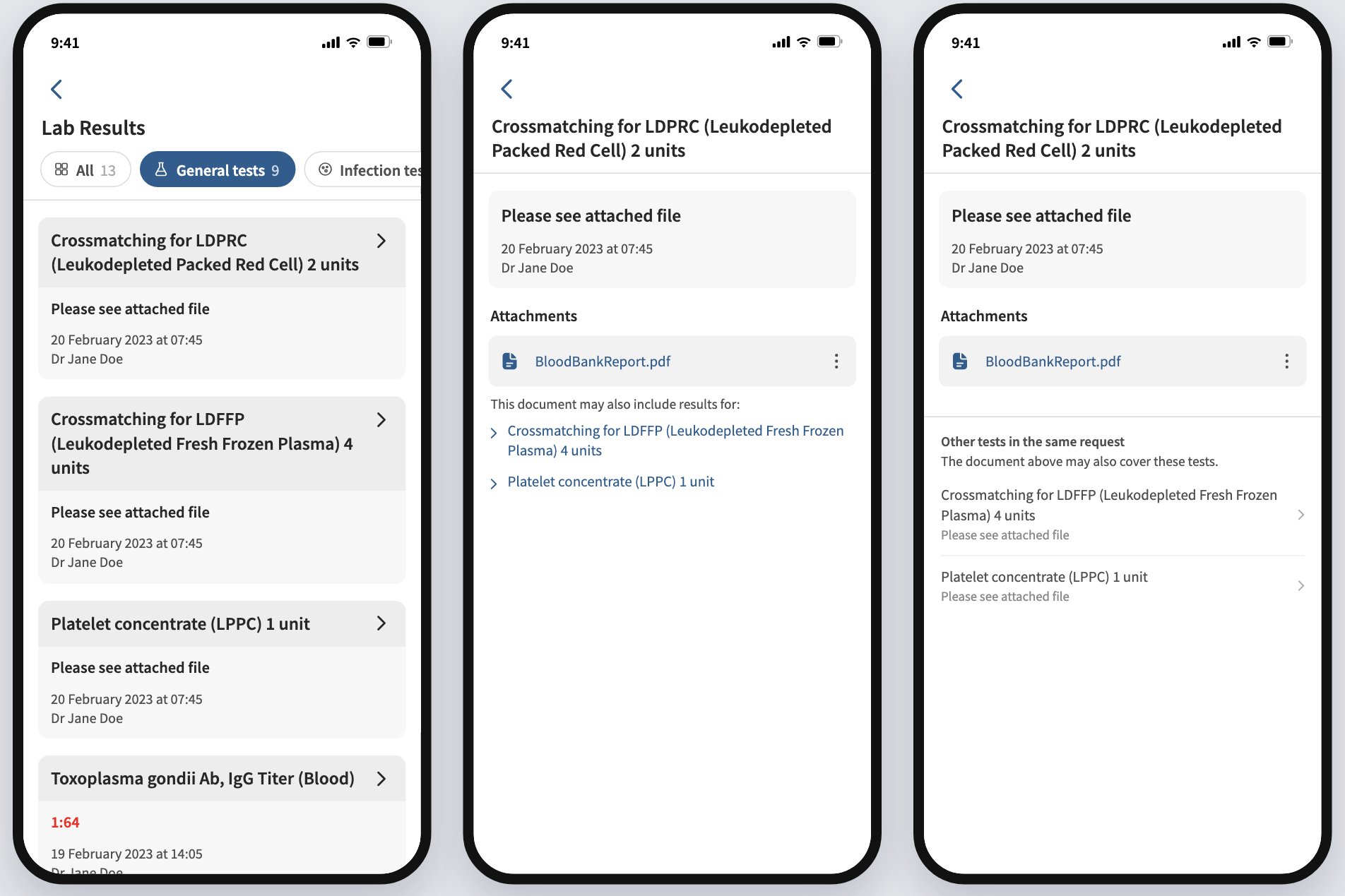
- 9:41Crossmatching for LDPRC (Leukodepleted Packed Red Cell) 2 unitsPlease see attached fileAttachmentsBloodBankReport.pdf⋮9:41Crossmatching for LDPRC (Leukodepleted Packed Red Cell) 2 unitsPlease see attached fileAttachmentsBloodBankReport.pdf⋮This document may also include results for:› Crossmatching for LDFFP (Leukodepleted Fresh Frozen Plasma) 4 units› Platelet concentrate (LPPC) 1 unitProblem 4
One file, three results
Three blood bank results come back as one PDF. Each opens the same file with no hint it covers the others.
Before · No hint it's shared After - Fix 4
A quiet line under the file
“This document may also include results for…” with light links. No extra box, so the result stays the focus.
- 9:41Crossmatching for LDPRC (Leukodepleted Packed Red Cell) 2 unitsPlease see attached fileAttachmentsBloodBankReport.pdf⋮This document may also include results for:› Crossmatching for LDFFP (Leukodepleted Fresh Frozen Plasma) 4 units› Platelet concentrate (LPPC) 1 unit9:41Crossmatching for LDPRC (Leukodepleted Packed Red Cell) 2 unitsPlease see attached fileProblem 5
A file can carry a hidden result
Some results are hidden from patients, one test at a time. A shared file could still contain one.
Before · Hidden result inside After - Fix 5
One hidden test hides the file
If any test in the group is hidden, the shared file and that test's link don't show.
- 9:41Lab ResultsAmphetamine/Methamphetamine (Urine) screening testNegativeHepatitis B surface Antibody (HBsAb)19results›CKD-EPI: eGFR if Chinese›90.82 mL/min/1.73m^2Fasting Blood Sugar (FBS)›102 mg/dLReference Range7099Complete Blood Count (CBC)19results›RBC3-5 Cell/HPF9:41Lab ResultsAll 13General tests 9Infection tests 2Biopsy & cell tests 1Genetic tests 1Amphetamine/Methamphetamine (Urine) screening testNegativeHepatitis B surface Antibody (HBsAb)19results›CKD-EPI: eGFR if Chinese›90.82 mL/min/1.73m^2Fasting Blood Sugar (FBS)›102 mg/dLReference Range7099Complete Blood Count (CBC)19results›RBC3-5 Cell/HPFResult
Old or new?
Flip between the list as it was and the four groups.
Old New
Screens redrawn with sample data. No real patient, doctor or result is shown.
| Group | Hospital categories |
|---|---|
| General tests ตรวจทั่วไป | Chemistry, hematology, immunology, urinalysis and body fluid, POCT, blood bank, stool exam, referral lab (already in the app today) |
| Infection tests ตรวจหาเชื้อ | Microbiology, molecular biology |
| Biopsy & cell tests ตรวจชิ้นเนื้อและเซลล์ | Surgical pathology, cytopathology (GYN), cytopathology (non-GYN) |
| Genetic tests ตรวจพันธุกรรม | Genomics |
Alongside this I worked out how DICOM scan images should display in the app.
Part 2 · Inpatient meals
Ward staff order meals for inpatients. Each order must respect the doctor's diet order, the patient's swallowing, the room type and the kitchen's billing rules. Much of it ran on paper slips and food cards.
Discovery
I recorded a walkthrough with ward staff and sent the clinical nutrition team a round of questions. Then I mapped the journey and the menu rules, because those rules decide which colour of slip reaches the kitchen.
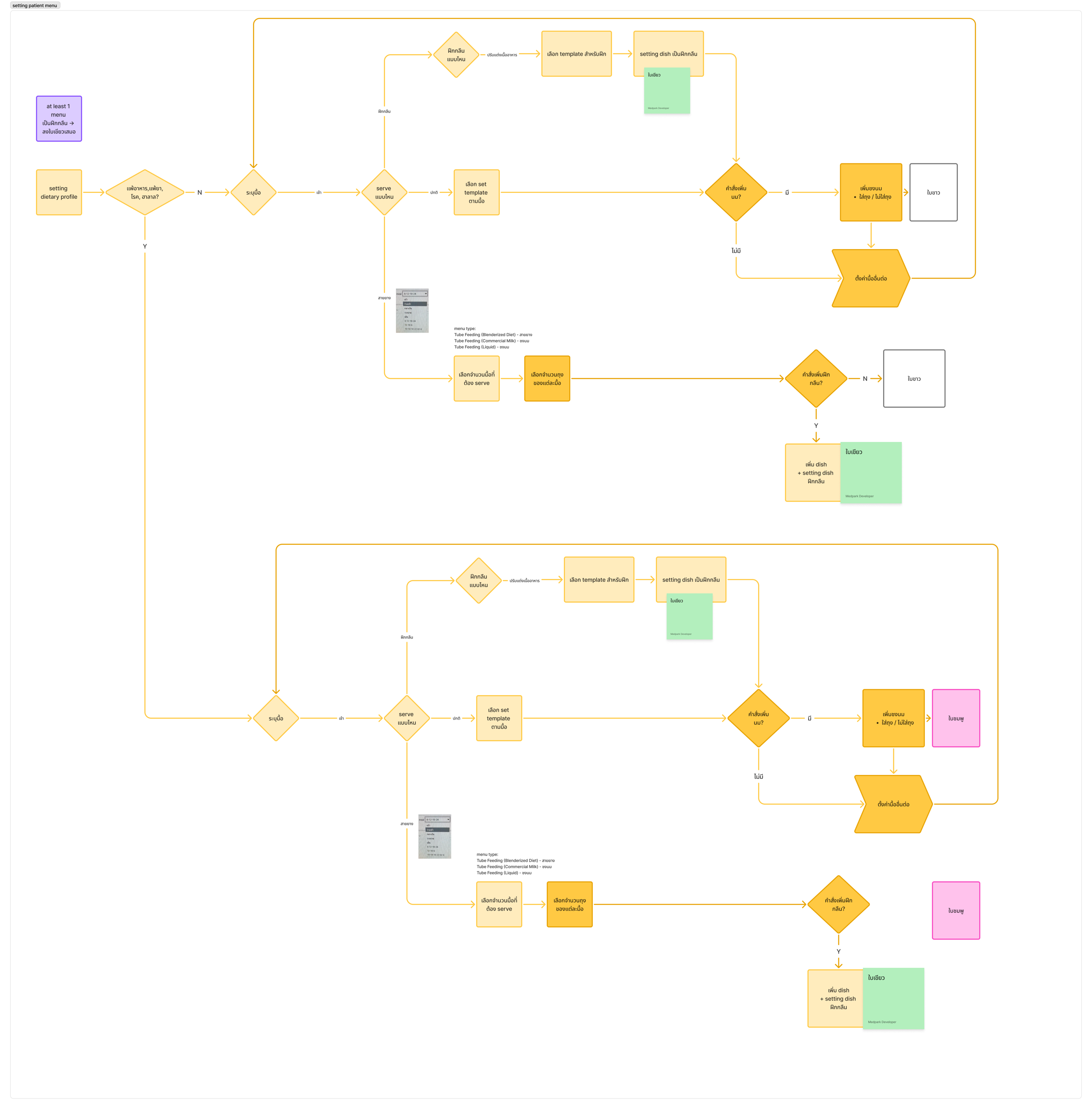
Three questions per meal pick the slip the kitchen cooks from:
No: the regular path. Yes: the same steps on a separate path, ending in a pink slip (ใบชมพู).
Normal: pick a template set for the meal. Swallowing training: pick the level, a training template and training dishes. Tube feeding: pick how many meals to serve and the bags per meal.
Milk can be added, in a bag or not. A tube-fed patient can also get a swallowing-training dish.
ใบขาว white regular meals · ใบเขียว green swallowing training · ใบชมพู pink allergies, disease or halal
The diet type drives the flow
The old diet dialog handled restrictions, disease and patient type. But swallowing training was a yes/no switch with no IDDSI level, tube feeding had no screen, and patients who can't eat got a generic empty state. I rebuilt it so the diet type decides what can be ordered: 20 types, set by the nutritionist, from regular food to tube feeding. Five screens cover it, from the diet dialog to the kitchen's cooking summary.
Every swallowing-training dish must carry an IDDSI level, with no default. A missing level is a safety problem, so a menu with one can't be published at all.
Testing it with the nutrition team
I wrote a 60-minute moderated test on the DEV build and rewrote it after feedback. Each task hides a twist, something that happens mid-task on a real ward, to see what people do when the plan changes.
The 60 minutes · one participant on the DEV build
- Welcome3 min
- Task 118 min
- 2.112 min
- 2.27 min
- 38 min
- 3.15 min
- Debrief7 min
- Task 1Build the menu
Create 3 dishes, then a menu template that matches the kitchen's paper menu sheet.
- Task 2.1Take a VVIP order
Patient and relative order on the tablet.
TwistThe relative asks for a dish that isn't on the menu, and someone comments on yesterday's food. The tablet has no answer for either, on purpose.
- Task 2.2The doctor changes the order
Review the Cooking Summary.
TwistA dev switches the diet order to iodine-restricted in the hospital system as the task starts.
- Task 3Tube feeding
Set up a blenderized tube feed through to the Cooking Summary.
- Task 3.1A message from OT
Add swallowing training on top of the tube feed.
TwistA printed LINE message from the occupational therapist asks for 2 cups of swallowing-training food.
When someone gets stuck
- ✓Did it alone
- H1Restate the goalafter ~60 s stuck
- H2Point to the screen area~60 s more
- H3Show it, then hand back~3 min on one step
- ✗Facilitator completes it
Who's in the room
- FacilitatorReads each scenario, plays the patient and relative, hands over props
- Note-takerFills the observation sheet and minutes per task. Never speaks
- Dev on standbyChanges the doctor's order live, reseeds data if something breaks
Rules I set
- Task sheets name the screen to go to. Buttons stay unnamed
- Never say right or wrong. “What do you think?” instead
- A 1 to 7 ease score after every task
- White paper only: pink and green slips are real kitchen signals
- Test patients seeded in DEV instead of printed patient cards
Draft 1 → version 2
8 scenarios cut to 5 tasks, patient cards, a payment report
3 tasks in 5 parts, with the twists that matter: a live order change and requests the system can't handle
I ran it with 3 nutritionists. The flow held up. Most feedback was about features we hadn't built yet, and those went into the backlog.
Part 3 · The patient order list
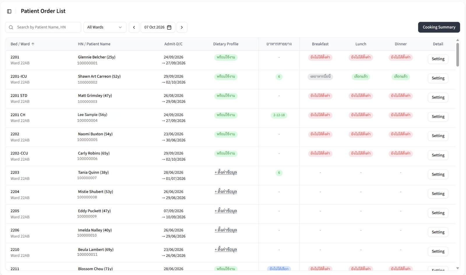
Nutritionists start every day on the Patient Order List, then open a patient to set meals and publish the menu. The team sent 10 feedback points. I grouped them by the real problem and prototyped with Claude; the domain decisions stayed mine.
 Problem 1
A Setting button on every row
A whole column repeated one button. It used space and said nothing.
Before · Same button, every row After - Fix 1
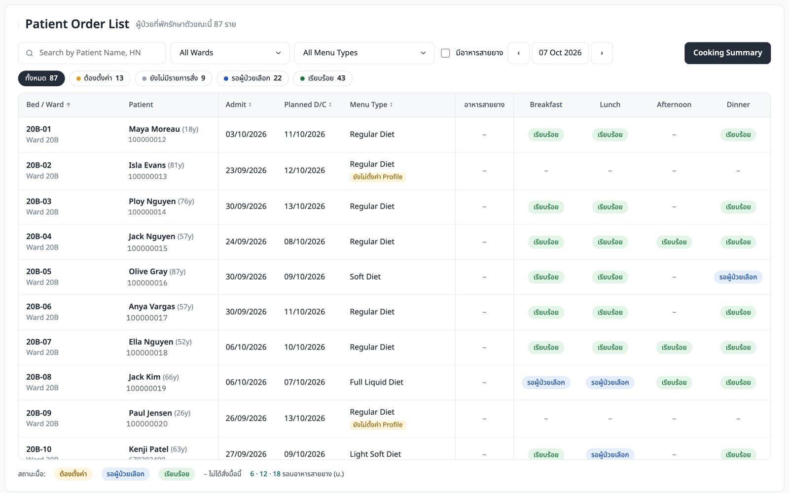
The name is the link. Menu Type takes the column
One change answered 3 of the 10 comments. - Problem 2
Red everywhere, and “–” meant two things
“–” could mean not needed or not done yet. With most cells red, nothing stood out.
Before · 8+ labels, mostly red After - Fix 2
3 statuses, plus “–”, counted on top
ต้องตั้งค่ารอผู้ป่วยเลือกเรียบร้อยยังไม่มีรายการสั่งNeeds setup · waiting for the patient · done · nothing ordered yet
Chips with counts show what's left across the hospital. - Problem 3
Pages, or one long list?
The team wanted pagination gone. I worried about load time.
Before · Pages or one list? After - Fix 3 · decided by data
One hospital-wide list
The September census: about 87 inpatients a day, 11 wards, the largest about 19. Loading 87 rows is fine. Scanning them is the hard part. I also built ward sections; the team compared both hands-on and kept the flat list. 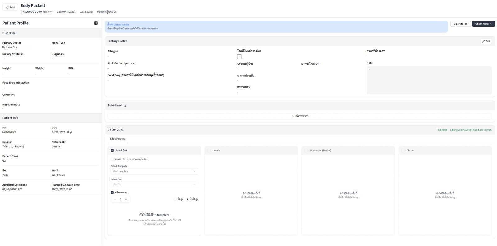
 Problem 4
“A Menu Type means the profile is set”
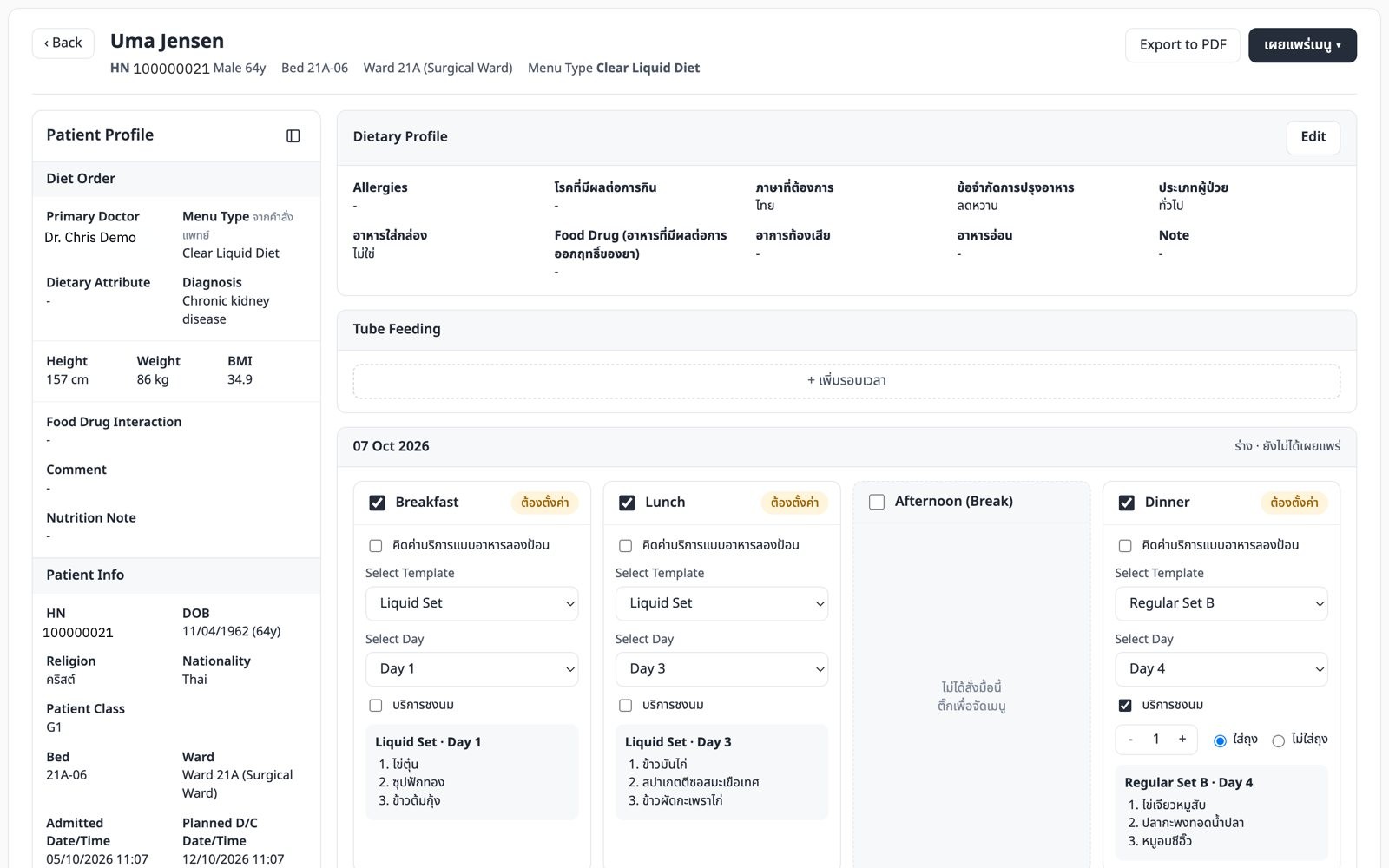
My early idea. The real settings page showed Menu Type sits in the doctor's diet order, apart from the dietary profile.
Before · My wrong guess After - Fix 4 · a real screen corrected me
Menu Type comes from the doctor
The team confirmed 3 rules: Menu Type is read-only and never blocks anything, tube-fed patients can also eat normal meals, and the only hard gate is dietary profile first. 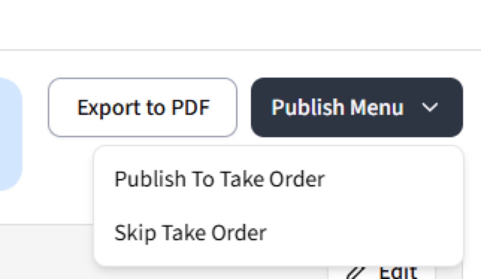
 Problem 5
Publish To Take Order, or Skip Take Order?
Both describe what the system does, and neither fits an order that is only tube feeding or milk.
Before · System words After - Fix 5
Say who picks the menu
- Normal meals Let the patient choose, or assign the menu
- Tube feeding or milk only One button: confirm order
- No profile yet Disabled, with the reason next to it
- Editing after publishing Back to draft, with a warning if the patient already chose
- Result
Old or new?
Flip between the list as it was and the list in the prototype.
Old New
What I took from it
- Feedback is a list of symptoms. Group it by the problem before designing.
- Check ideas against the real screens early. One screenshot overturned my assumption.
- Data settled the pagination debate faster than opinion.
- Building an option and dropping it is fine when the team gets to compare both.
Also in the build: admit and discharge as separate sortable columns, scroll position and filters kept when you come back from a patient. No production numbers yet. Next: a ward settings page and cleaning up menus published without a profile.
What I'm learning
In a hospital, a label that's slightly wrong is worse than one that's vague. Most of my decisions here came from asking what happens if a nurse or a patient takes the screen literally.